Using the Golden Ratio in UX design
Dino Vidakovic
⚡️Writing about the impact of AI on UX 🚀CEO & Founder 👾Chief Pixel Pusher @ PushYourPixels.com
The Golden Ratio has long been a staple of Western design, and its subtle influence permeates art, architecture, and now UX, graphic design, and typography. Using it in our designs can be beneficial, and there are many ways we can go about it when designing visuals and interfaces.
Math in design
I know, most people don’t really get excited at the mention of mathematics. Since it’s a big part of UX design though (as I’ve discussed in my previous article), we designers make extensive use of it in our line of work. Grid systems, layouts, typography, vector graphics—a lot of design aspects greatly benefit from some applied math.
While math in and of itself might not seem as enticing, there are some interesting mathematical phenomena that are able to capture the interest of even the staunchest math-haters; the most popular among these phenomena arguably being the Golden Ratio (Φ).
Throughout history, designs and visuals in Western cultures have often implemented it in its various forms. And since it’s still fascinating to many, it gets a lot of use in modern times as well. Its unrelenting popularity is certainly compelling, if not exactly mysterious; we humans do like ourselves some harmony and good proportions, after all.
And why change a winning horse, anyway? If people liked its proportions in ancient architecture and Renaissance paintings, they’re most certainly still going to like it in their favorite food delivery app or cat video platform. Therefore, quite unsurprisingly, there are many ways in which the Golden Ratio can be (and is) used in UX design, and I’m about to go over some of them… also quite unsurprisingly.
The Golden Ratio
I probably don’t have to explain the Golden Ratio too much. But for those yet unfamiliar, the Golden Ratio (Φ ≈ 1.61803) is a mathematical constant with some interesting properties, and some of its various implementations are widely considered (in the West, at least) to result in aesthetically pleasing proportions.
One visual representation of the Golden Ratio is to divide a line (a) into two segments of unequal length, with the longer segment (b)being proportional in length to the shorter segment (c) in the same ratio as the proportion of the whole line (a) to the longer segment (b). So, a : b = b : c.

It’s connected to the Fibonacci numbers, a sequence where each number (after the first two) is the sum of the previous number plus the number before that (e.g. 1, 1, 2, 3, 5, 8, 13, 21 etc.). The Fibonacci sequence is interesting in part because the ratio between each two consecutive numbers slowly approaches the Golden Ratio (1.61803…) as the numbers get bigger.
You’ve probably come across the golden rectangle, where cutting it into a square and a rectangle produces another golden rectangle:

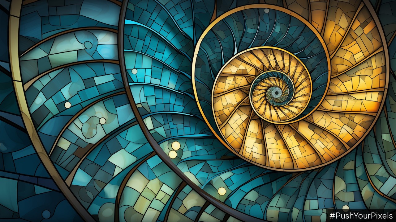
And you’ve even more likely seen the Fibonacci spiral, which can be derived from a series of golden rectangles; connecting the opposite corners of the squares in the sequence with a quarter-arch produces a spiral that is very similar to the true golden spiral (which is a logarithmic spiral whose rate of growth is a constant Φ—a small, but significant difference between the two).

Metallic numbers
By the way, did you know there are other so-called metallic ratios besides the Golden Ratio?
While we get the Golden Ratio by dividing a line into two segments, the Silver Ratio is made by dividing a line into three segments—two being of equal length, and the third one being proportional in length to one of the longer segments in the same ratio as the proportion of the one longer segment to the whole line. And as the Golden Ratio is connected to the Fibonacci numbers, so is the Silver Ratio connected to the Pell numbers, where each number in the sequence is the sum of the previous number times two and the one before that.
The Bronze Ratio follows a similar pattern, with four line segments in total, three of them the same length; other metallic ratios continue by adding one new segment each time.
Might be interesting to experiment with these for UX purposes, too. For now though, we’re sticking to the Golden Ratio.
The Golden Ratio in UX design
When it comes to UX design, the Golden Ratio can serve as a useful guiding principle. Here’s a couple of practical ideas from NN Group.
The golden/Fibonacci spiral can be overlayed on an image, with the focal point of the image aligned with the starting point of the spiral. This way the Golden Ratio can be used as an easy aid for composition or cropping. You can crop along the borders of the rectangle fitted around the spiral, and the focal point being off-center makes the composition a bit more interesting and dynamic, depending on the subject and the intended result.
And what happens when you divide a golden rectangle into a square and a smaller golden rectangle? You get a very nice 2-column layout ready for implementation as a main content area and sidebar.
… For desktops, at least. Today’s responsive design complicates things a bit, requiring different approaches for different devices. You need to take this into account, obviously.
You can also use the Golden Ratio for your grids while designing, and the golden rectangle and golden spiral can be used for various visuals and icon designs.
The Golden Ratio in typography
Meticulously scaling font sizes, line spacing, and margins serves to achieve the delicate equilibrium where the text is both readable and pleasing to the eye.
For instance, the Golden Ratio can be used for calculating line height (the font height plus the white space between lines of text). Multiplying the font size with Φ results in a line height that’s balanced according to the Golden Ratio. So, for a font size of 16 px, the line height would be calculated like this: 16Φ = 16 × 1.618 = 25.888 (rounded to 26 px).
Keep in mind that line height should also be thought of in relation to line length, since long line lengths need more spacing between them to help with readability. It’s generally harder for the eyes to find the next line if the spacing is too narrow.
When it comes to font sizes themselves, a very simple implementation of the Golden Ratio would be turning your typographic hierarchy into a Fibonacci sequence. So, for elements P, H3, H2, and H1, you would get font sizes 16 px, 24 px, 40 px, and 64 px. Depending on the number of elements in the hierarchy needed, this might not be implementable in all instances, since the bigger headings might end up way too big in relation to the other sizes.
But could we make the rate of growth slower then, while still using the Golden Ratio?
Typographic scaling: an experiment
I've been experimenting with other design ratios based on Φ, and I’ve found the experiments largely yielded visually appealing typographic hierarchies as well. Specifically, I used the idea of scaling the Golden Ratio for some experimentation with typographic scaling.
I used several different percentage scalings of the Golden Ratio to see how it would impact font sizes in a typographic layout (in this case, H1, H2, H3, and P). Here are some of them:

The math
For example, for a 75% scaling, I first used the inverse of Φ, which is 1/Φ ≈ 0.61803, expressed as a rough percentage: 61.8% (s). I took 75% of this percentage, which gives us 46.35%. Using this scaled-down percentage (s₁), I recalculated the sizes for each heading, starting with a baseline paragraph font of 16px.
So, for the 75% scaling, the percentage increase (s₁) is 46.35%, and thus:
H1: 50px (H2+46.35%)
H2: 34px (H3+46.35%)
H3: 23px (P+46.35%)
P: 16px (Baseline)
The spacing between each element is equal to the size of H2 in each case.
The other two scalings presented in the graphic above are 66% (s₂ = 40.79%) and 50% (s₃ = 30.9%).
(Note that, while this can certainly be applied using REM units, I’m using pixels for font sizes for simplicity and ease of explanation.)
Now, to be clear, these scalings are not using the Golden Ratio per se (except the one with the 61.8% increase). What I’ve created here are, basically, several geometric sequences using different constants that I derived from Φ. I found that each scaling, despite being different, resulted in a well-balanced typographic hierarchy. While the scaled percentages no longer follow the Golden Ratio themselves—since Φ is a mathematical constant—I still found it interesting that they were aesthetically pleasing all the same.
Eyes are still indispensable
Even though it might be obvious, I feel like this needs to be said: while mathematical principles can provide a solid foundation, blindly shoving the Golden Ratio wherever you can think of will very likely lead to some pretty questionable designs. Use your eyes; they are still very much important. (Just don’t start eyeballing everything instead, either.)
Yes, mathematical precision is very alluring and useful, especially if it helps our design process become easier or more streamlined. That’s why we have design systems, after all. But design as a whole is not merely a formula to be solved, and these mathematical principles are certainly not a substitute for your own judgment. But it certainly pays to get familiar and experiment with them, as they can prove to be a great tool.
This article was originally published on PushYourPixels.com.
Applied mathematics (student) | experienced software developer | mathematical modelling
4moI think we tend to get a little too excited about the golden ratio. It definitely is an interesting number, but there seems to be a popular perception that it appears everywhere. Claims like that are often spurious. It is an irrational number, so the chances of it actually appearing in nature are slim to none.