


A masterstroke of design – LEGO Typewriter Designers Q&A (RLFM Days 2021)
June 12, 2021
|
 0
0
0
At LEGO’s Virtual RLFM Days 2021, we managed to get a very early preview of the newly announced LEGO Typewriter during an extended LEGO Ideas session where we got to hear from Samuel Johnson, Design Manager for LEGO Ideas, Design Master Wes Talbott and Designer James May, the latter two worked on bringing Steve Guinness’ Typewriter to life.
It was quite the reveal, and watching fan media react live to the Typewriter reveal, and the live chat literally went off when the Typewriter was unveiled.
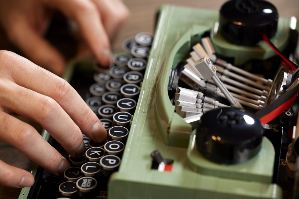
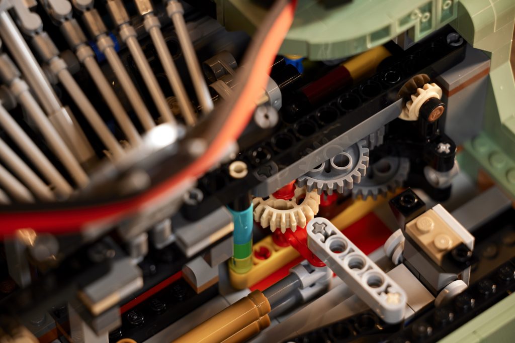
And that was just a reaction to the model – when the designers zoomed in to the keys (more whooping to the printed elements) and when they struck the keys to show off that they emulated real life, and when they showed that the platen roller moved along as well,
The video feed was a little grainy (classic Microsoft Teams) but even the low-res video showed off the Typewriter’s design, and features in excellent clarity , and it was crystal clear that LEGO Ideas had another bona fide hit on their hands.
Looking at the designers, they were beaming showing the Typewriter off, and it was really cool to see them looking pleased with the reception from some of the top LEGO bloggers, content creators and influencers in the world. From a professional perspective, that must feel incredibly fulfilling to see such a positive reaction to their work and effort.


Here’s a quick recap of the Group Q&A session with Samuel Johnson, Wes Talbott and James May about the design of the LEGO Ideas Typewriter.
Note: some edits have been made to the original transcript for brevity, and make for an easier read.

Does this model take inspiration from any specific real-life typewriters?
Wes: We referenced a couple. We have one guy, Matt Boyle in our company who is a real typewriter fan, and collects a lot of different ones so he was able to lend us a few to look at the mechanisms.
We looked at two or three different models, but also did a lot of research into the time period, like we took into account things like the fact that the keys are circular.
There’s a certain era of typewriter which has that type of key to bring that kind of 30s vibe. It’s not an IP (intellectual property) model, so we couldn’t reference an exact one and we kind of just made up things, which was nice because it , gave us the freedom to carve out space where we needed to, or change the shape in ways that the bricks fit.
Are there stickers, or are all parts printed?
James: There are, so the alphabet is printed, but there are two stickers. You get this shiny chrome sticker, System in Play and the System logo on the front, that’s also a sticker.
How did you decide on this specific colour? (sand green)
Wes: We had a lot of different ones.
James: Yeah, there’s gray and black, dark red but we thought that this had a nice classic colour to it – a bit more poppy but also not too crazy because then it would make it more modern
We also got input from the fan designer Steve Guinness. We showed him different options and he was part of the process for assigning colour as well.
How involved was the fan designer (Steve Guinness) in the design process?
Sam: From our perspective, we’re trying to bring the designer of the original submission in as close as possible to see how we’re treating it, and what the end result might end up being.
So what happens is, whilst we’re just deliberating which one we’re going to go for, the design team is trying to see if it’s possible to even make as a real LEGO Set.
We have pretty high standards of quality and build and stability. The team was working on some designs, just to see if we could make some mechanisms to bring Steve’s typewriter to life. When we had something to talk about we just had a call, showed him the updates, talk about the colours and we talked about the design of the font on the alphabet.
He has seen pretty much every aspect.
James: He actually came directly to visit.
Sam: He brought his family to Billund on holiday, between the two lockdowns, so he was in the LEGO house and we actually pulled him in to see it for real.
That’s a very rare treat for us, to actually show it in person, so he joined a design team meeting for real. It’s actually been pretty integrated into the team’s work.
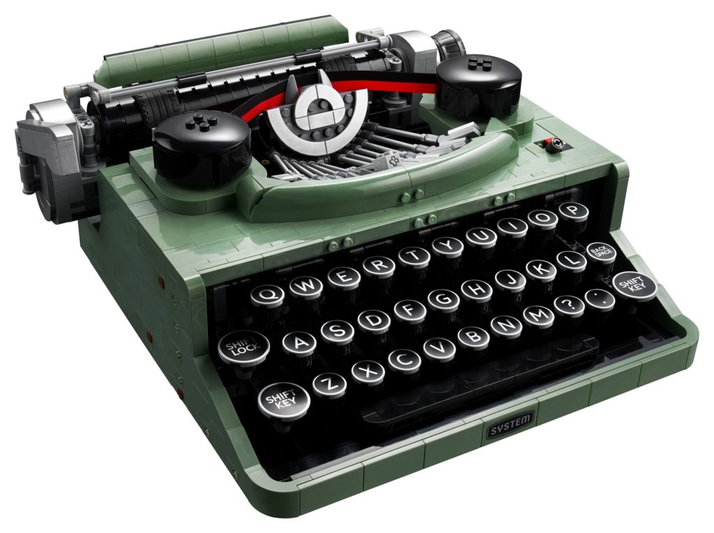
Jamie Berard commented that Lego always seeks to include studs to maintain the LEGO aesthetic, are these becoming less important for adult models?
Wes: Actually it’s funny you mentioned that because you will see a few studs on the front here.
These very easily could’ve been tiles, but for that reason, we realised if we didn’t put these studs there, the only studs that were visible were a few up here and then the four on here.
That’s always an aesthetic choice and different people have different tastes. I think it’s always nice if you have the opportunity to take them off if you want to for your own display, but in the official models we do try to have studs because its an important part of the LEGO brand identity

Does pressing the Shift Key do anything special?
James: It does not make a hamburger!
The shift key is not functional. if you see how a shift key works in a typewriter, the entire mechanism like literally shifts. and we didn’t have room for that, so we just made sure that like the backspace and the shift key, which wouldn’t type a letter so it doesn’t make sense that it would trigger the function.
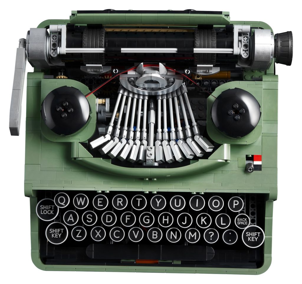
Was there a specific font designed specifically for the model?
Wes: It was designed specifically for the model.
We had a lot of different things we looked into, like making sure some of the letters were symmetrical like the S.
Oftentimes in fonts, the top is a little bit smaller than the bottom and things like that. We wanted to make sure that there wouldn’t be a wonky letter if you had it rotated the wrong way, and also just for for building MOCs and things like that there would be a systemic alphabet, that is really user friendly.
Was the font given a name?
James: Never give up on your dreams? We haven’t thought that far! I don’t think it’s even set up as a font, it’s just graphics. Yeah.
For James, how does it feel to go from (LEGO) fan to designer?
James: Yeah, it was pretty exciting. I was an intern from 2015 to 2016, and then after that, it was like okay, LEGO is what I want to do.
I then went back to university did a design course and then everything was set towards going back to LEGO and well, here I am now, so it all paid off! But yeah, it’s really, it’s really great to actually be here now.
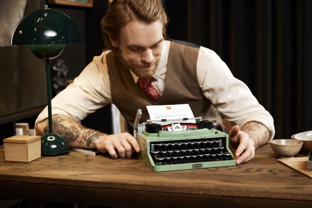
Why was the paper A5 instead of A4?
James: Size restrictions mainly, but it is also common in some typewriters that they would use A5.
So this is more based on a portable typewriter because there’s models that are a lot bigger and that would use larger sizes, whereas this is meant to be the like laptop version. Yeah, travel size, yeah travel size, so if it’s time
Was there a version which didn’t come with all the letters so that the set would be cheaper?
Sam: What would you type?
James: There was talk to make it cheaper by having it on stickers, but then you’d have to apply thirty-odd round stickers and we didn’t want to subject people to that.
There are no numbers, was that something that was considered?
James: in terms of portable typewriters, they tend to have less rows and the idea would be that you press the shift key to get a number. We had a big debate, and we included Steve Guinness on whether we have just a full letter on a key or if it would be like a smaller one with with a number above it.
In the end we decided that if you just have a clean letter tile, that would be better for use in other models and MOCs at home and it’ll be more useful to fan builders. You can spell out your name without having the numbers also cluttering it up.

Are there any Easter Eggs or personal references in the set?
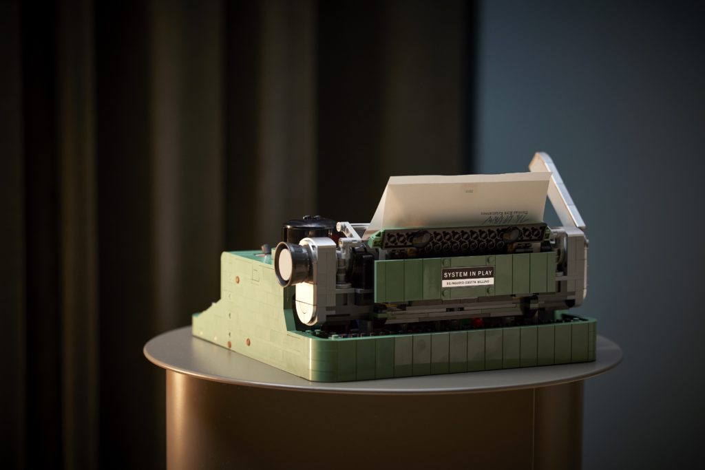
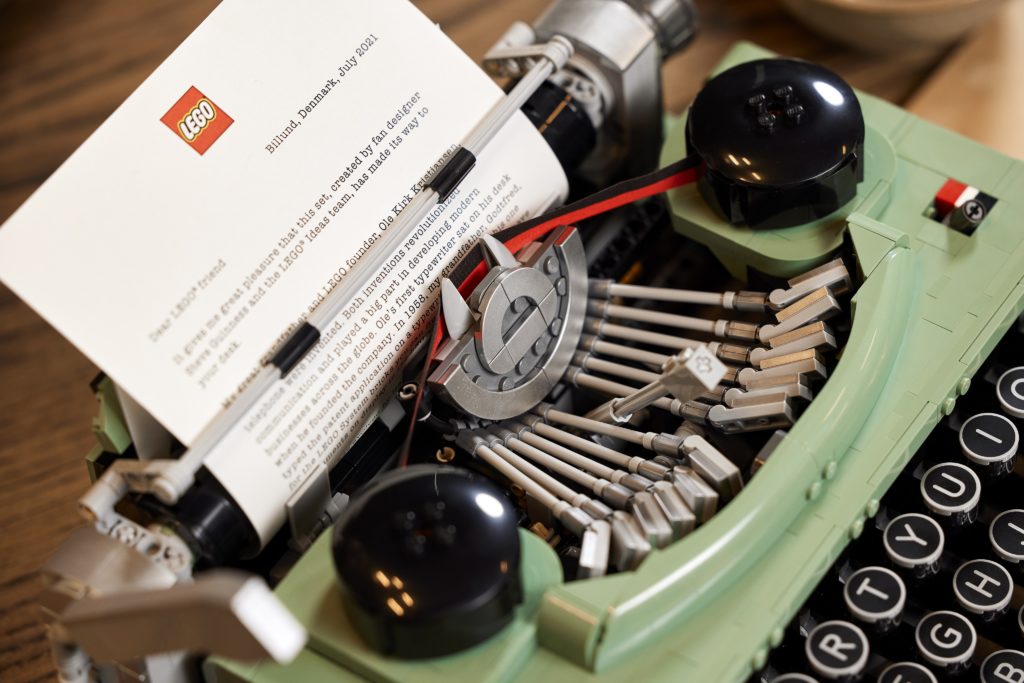
Sam: The main one is Steve Guinness’s personal reference. We’re always trying to give them fan designers some kind of recognition in the set, so the label on the back has a kind of serial number (I think that’s his birthday). It has SG for Steve Guinness, and then it has the NGUOYD.. Yeah, this is the acronym for Never give up on your dreams
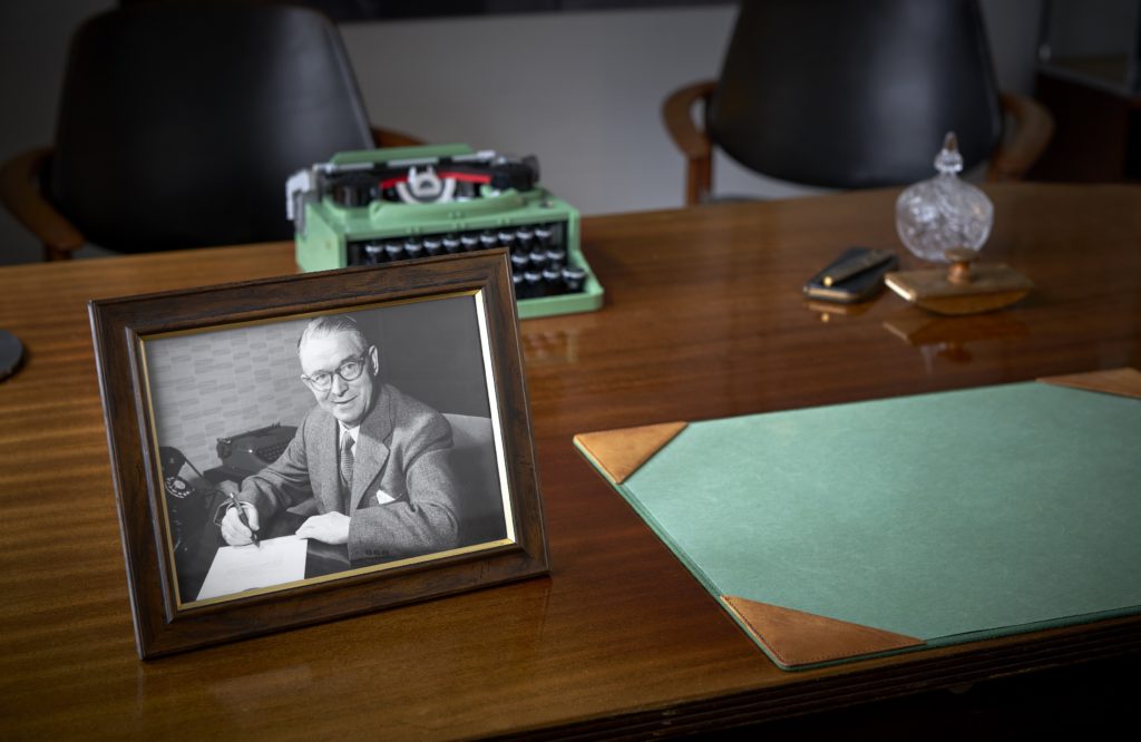
We were really excited by this photo that Steve found of Old Kirk Christiansen in his office, where he has a typewriter in the background, which could have been sand green.

We were really inspired by this photo, and that’s why we contacted Thomas Kirk to get involved because his great grandfather was involved, from a photographic point of view. So that’s why we have the System logo on the front, its kind of a reference to the LEGO system and the founders.
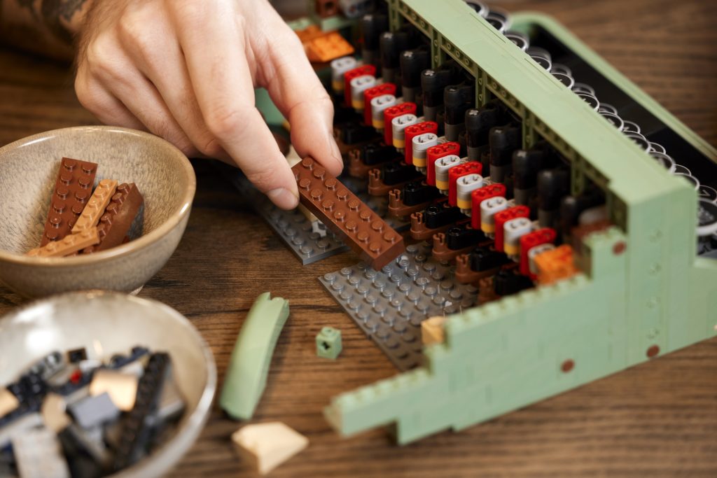
There seems to be an increase in the usage of drum-lacquered elements recently, has there been an improvement in the production process to make them more available or cost efficient?
Sam: All I can say really is that every LEGO piece in every different colour has a different value, so a different price that it costs to add that to a LEGO set.
The more you do to a LEGO element, the more it costs. So for example, the more printing put on it, the higher the price that piece becomes.
So, in this case we know that it (typewriters) are supposed to be metal, so we wanted to add this as much of this silver as possible.
It has some elements but we didn’t want to overdo it, and just do everything, and we can’t, because there was actually a limitation on what’s possible to paint with this drum lacquer. So it’s mostly tiles that have this effect on them.
Wes: You could say it’s also because when you have other models in the lineup that have used a lot of drum lacquer. We have a limited number of existing elements at all times.
When another model changes a bunch of colours to be drum lacquered, then that makes them available for other products to use. It’s easier for everyone to use more when some more are made.
But that’s not always the case and we always have to delete them, sometimes pretty quickly, in order to make room for new colour changes elsewhere in the company.
How long will it take to be built by fans?
Wes: A while. It’s definitely a challenging model, I’ll just say that.
James: It seems small, but there’s a lot of like small intricate details on the inside.
Thanks for reading, hope you enjoyed getting to learn a bit more into LEGO’s design process and it provided you with some additional insight into the LEGO Ideas Typewriter. Stay tuned for more interviews from RLFM Days 2021!
If you’d like to see more, be sure to also check out the LEGO Ideas Designer Video on Youtube.
The LEGO Ideas Typewriter has a will be released to LEGO VIPs on 16 June 2021, retailing for US$199.99 / AU$329.99 and will be available from LEGO.com, and LEGO Brand Stores.