

Colour study: Hot Pink
/Bright Winter and Bright Spring have a range of colours we might call “hot pink”.
Both seasons are high-chroma neutral, so these pinks can sometimes look pretty similar.
Plus they’re really popular in fashion and styling which means there are lots of options out there.
How can we tell them apart?
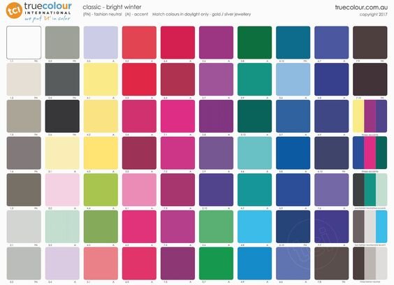
The presence of pure, cool red and violet distinguishes Winter.
Just so we are clear, this is what I mean by “red” and “violet” in this context.
You’ll find these colours in the True Winter palette.


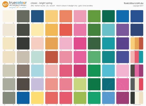
Spring’s core colour is warm, light, sunny yellow.
True Spring has loads of examples, such as these:


You can observe the influence these colours have on different kinds of hot pink.
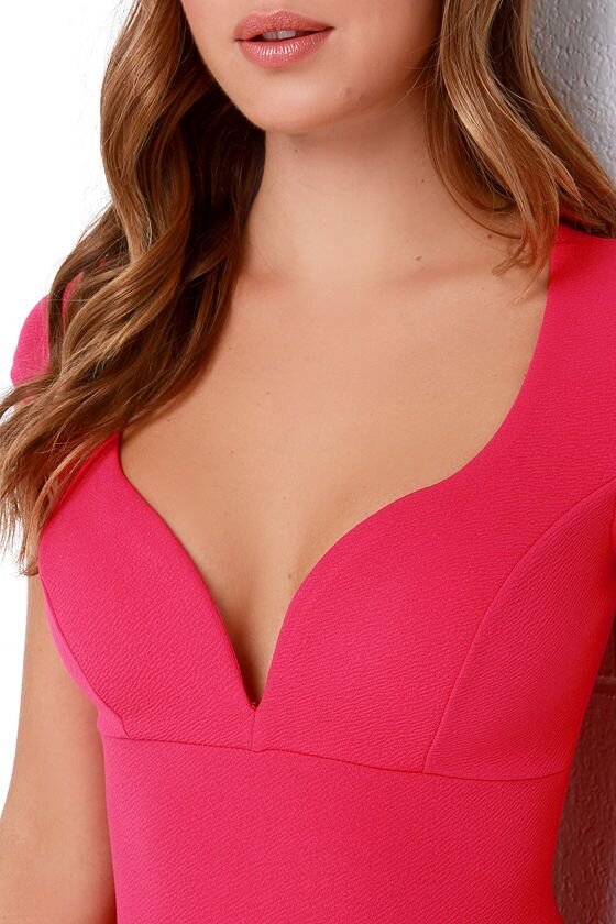
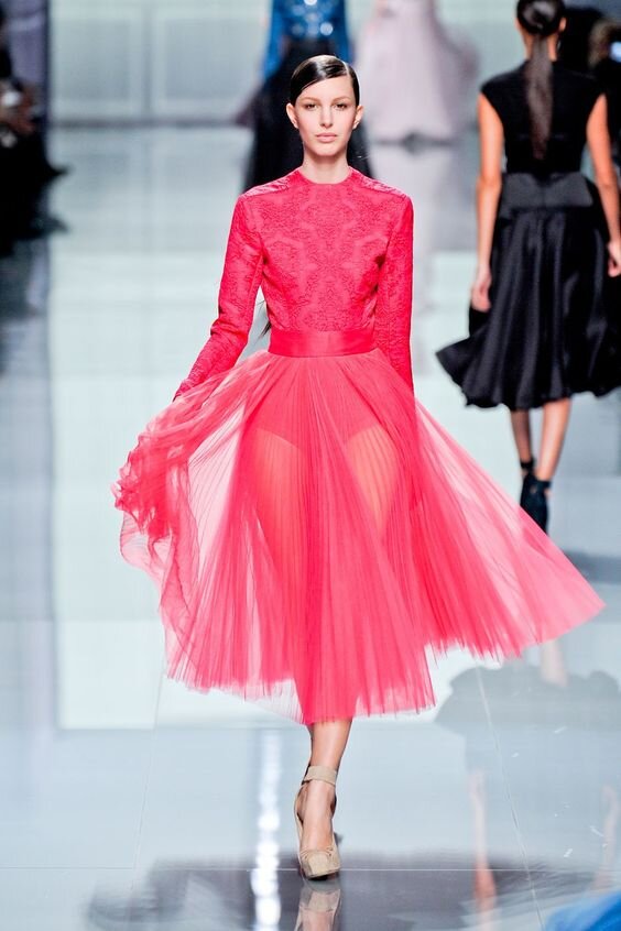
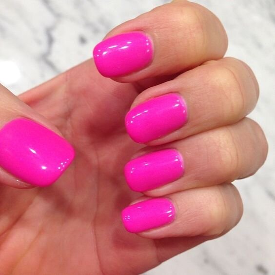
Bright Winter’s versions are much redder or magenta-like than Bright Spring’s.
Sometimes they look a little fluorescent.
They are also harder, heavier and denser - in other words, lower value.
Think Mexican pink, Barbie pink, fuchsia or Schiaparelli pink.
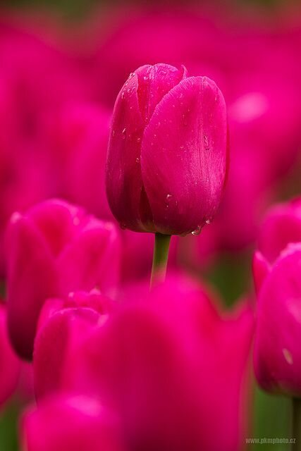
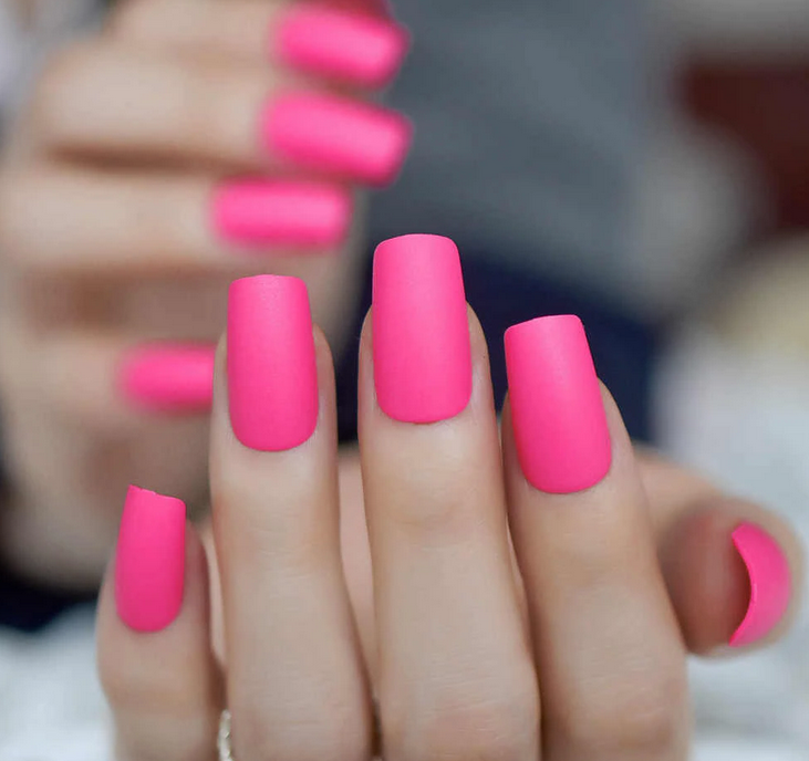
Bright Spring hot pinks are lighter and closer to coral because of their warm yellow base.
They’re festive, fresh and energetic.
We might describe some as candied.
Think bright bubblegum, fruit punch or fandango.

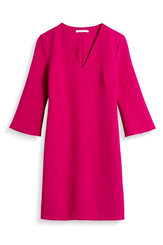
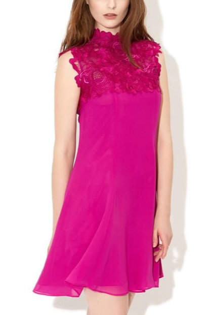
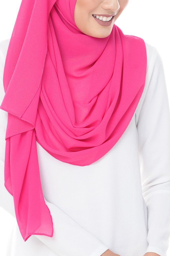
Look at the red/violet versus yellow influence in the following images.
Remember, these palettes are equal in brightness, it’s the hue and value that make them look different.

Here’s another tool you can use to frame your thinking when you’re making a decision.
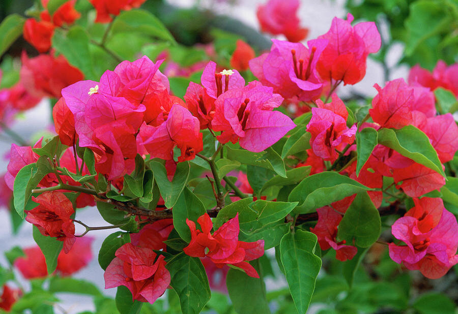
Try measuring the colour against something you know from the world around you.
For example, does the pink remind you of this bougainvillea?
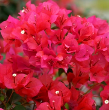
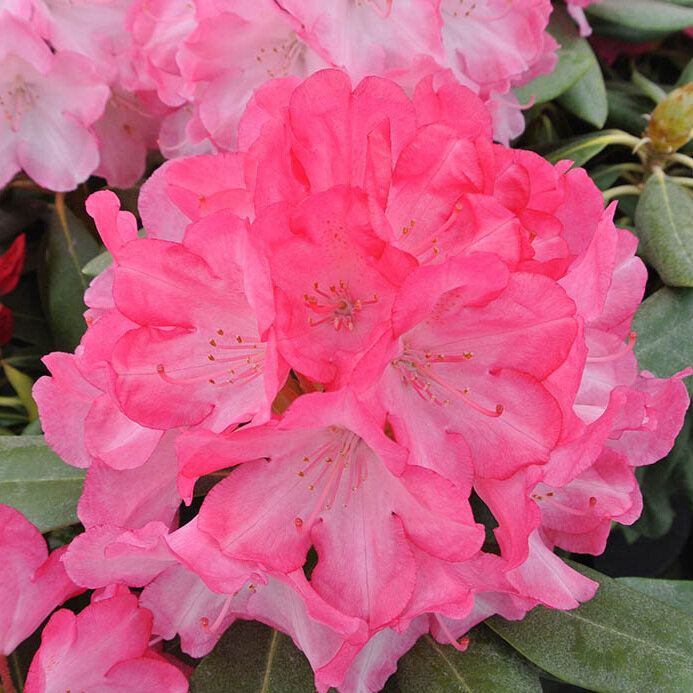
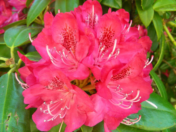
Or is it more like these rhododendrons?
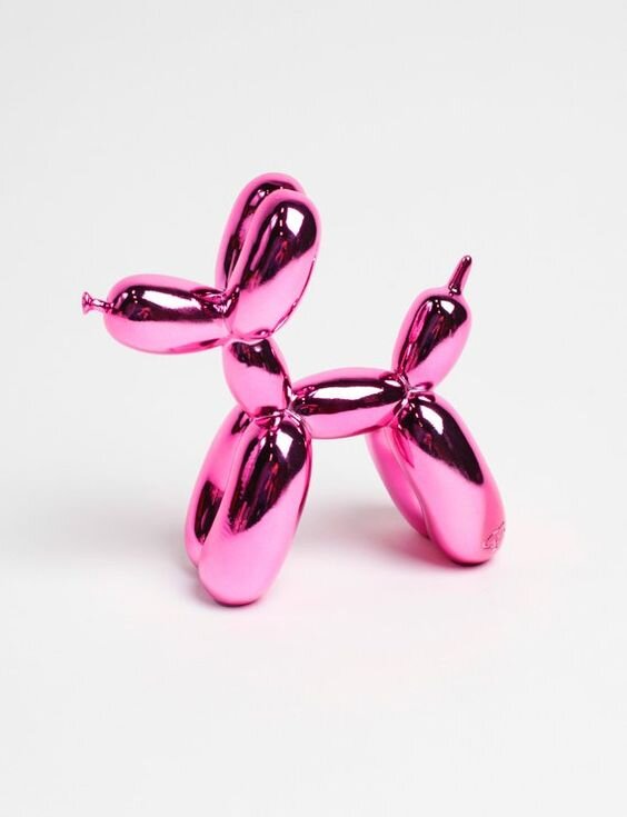
Dogs?

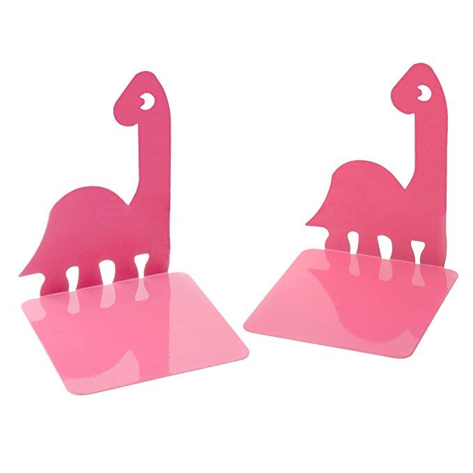
Or dinosaurs?

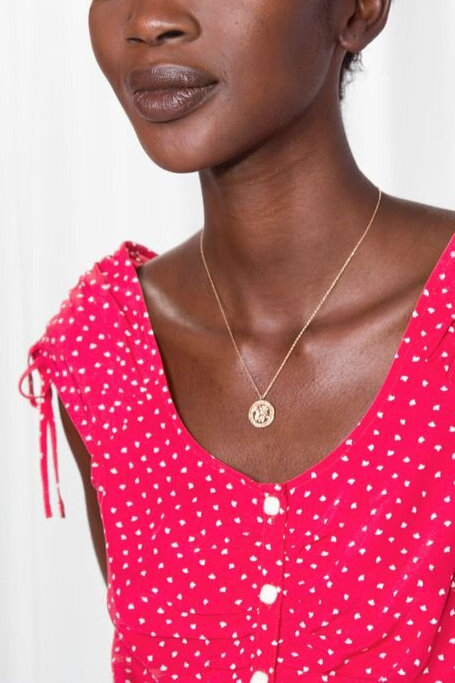
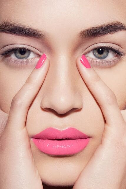
How about this beauty look…

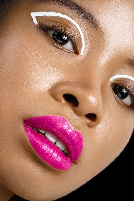
…versus this beauty look?

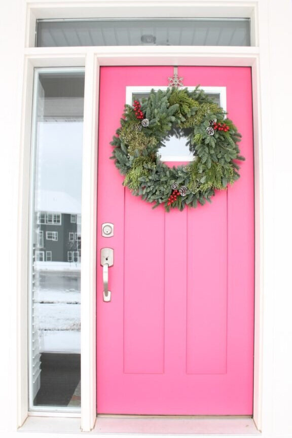
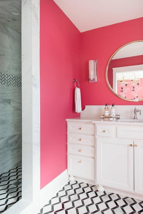
Home styling version #1?
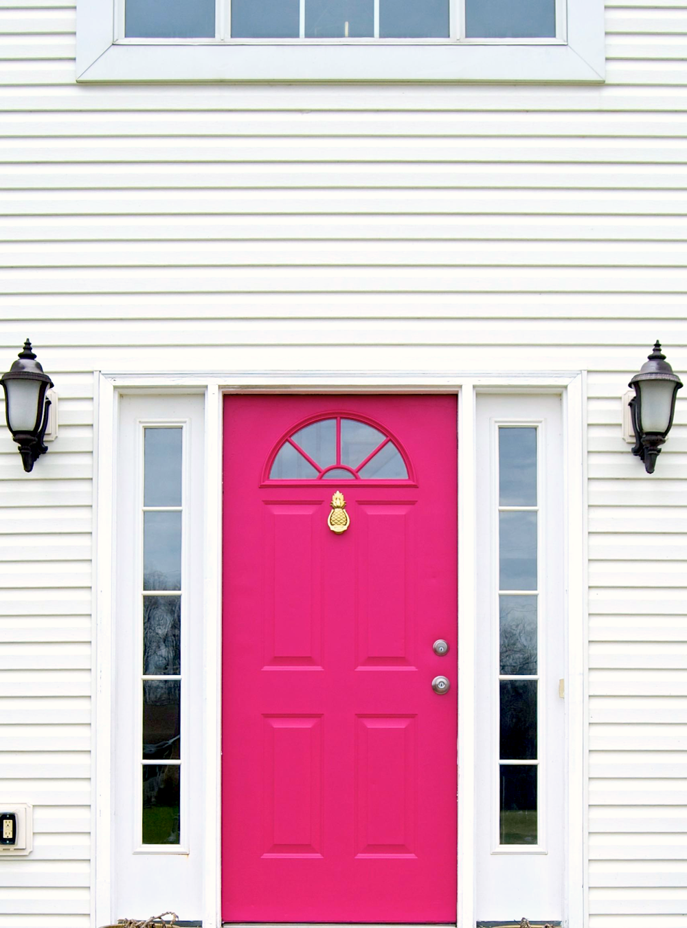

Or home styling version #2?
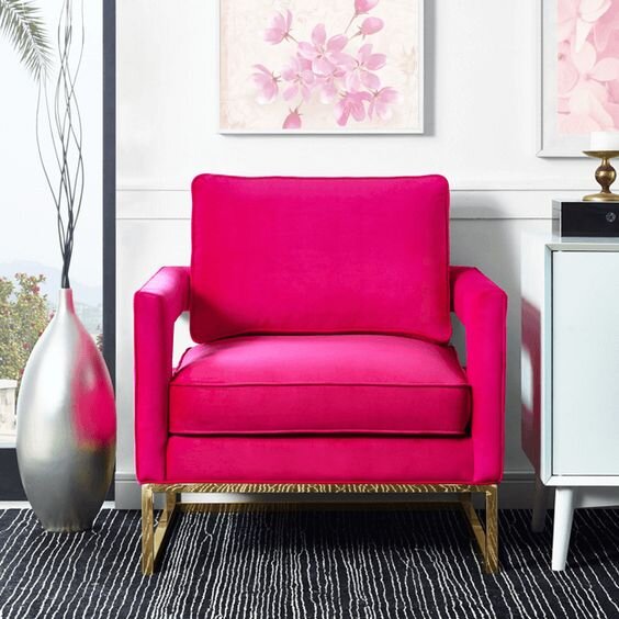
Can you imagine your pink as an edgy night-time showpiece?


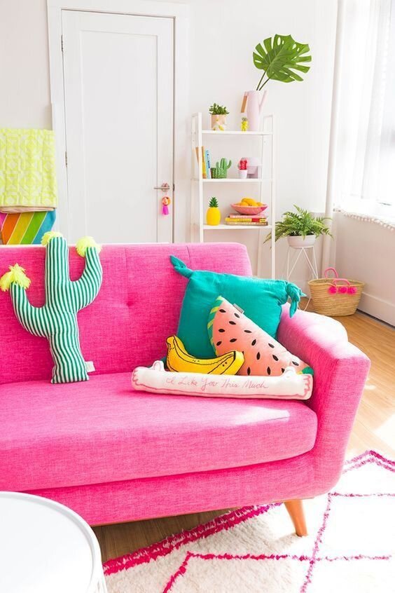
Or if you added a little golden orange, do you sense a tropical vibe?


Colour is relative so comparing and re-comparing is important practice.
Think from all angles when you do this exercise and over time you will start noticing the nuances.
Now, there is a place on this sliding scale where Bright Winter merges with Bright Spring.
After all, there are one or two suspiciously peachy tones in Bright Winter and the occasional purplish pink sneaking into Bright Spring.
What should you do if you’re not sure?
Try it on.
Even if you don’t like it.
Even if you have no intention of buying it.
Getting used to seeing yourself in two neighbouring palettes familiarises you with their effects.
And that leads to learning the difference between pretty good and phenomenal.
Because why settle for pretty good?
These guys get it.


Phenomenal.
So. In summary.
When trying to make a call about your best hot pink, consider whether you can spot any red or magenta tones waving at you from the back benches.
Think about how dense and edgy or light and fresh the colour feels.
Match your pinks with a landscape, mood or feature and see if it helps reinforce their separate personalities.
Or find your own methods that help you spot the difference.
Pick the right pink and it will love you right back.
