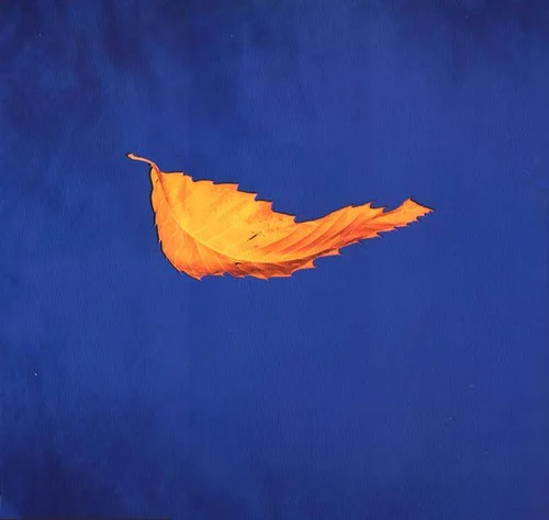
If I could name one piece of work from Peter Saville’s canon of work I have loved above all other it would be the fabulous ‘True Faith’ 12”. This beautiful gold leaf (Falling? Floating?) on a bed of International Klein Blue is so separate yet entwined to the back cover (with the absolute minimum of information: Name – Titles – Copyright – Fac183 catalogue number…. pre barcode!) fuses Art, Hi tech, Independent, Couture, Counter culture, and feels as new today as it did when I bought it.
In ‘87 my college thesis focussed on Peter Saville Associates (PSA) and Vaughan Oliver (V-23). As a result I worked at PSA from ‘88 to ‘89. I remember asking Peter to explain his rationale behind the front and back covers. He said that the expanse of white on the back cover made the copy-free front sleeve iconic like a painting, while the back cover served as the art catalogue. I loved that thinking. It was so Warhol.
Years later – I was watching an all day Tarkovsky retrospective at the Ritzy in Brixton, and saw the opening frames of ‘Solaris’ – the solitary leaf floating from right to left on the screen struck me as a literal moving interpretation of the sleeve I loved so much. A good omen for a phenomenal film!
Of course so much of Peter’s great ‘visual’ work is thanks to the genius of Trevor Key who had studio space next door. I remember watching the exploratory techniques Peter and Trevor were pioneering for ‘Fine Time’ and ‘Technique’ and thinking how great it was to be so progressive, it was incredibly inspirational for a 20 something graduate.
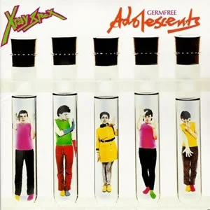
One day I was in Trevor’s studio talking to him about his work and looking through a massive pile of his old test polaroids (Including… X-Ray Spex “Germ Free Adolescents”) and I spied THE ORIGINAL polaroid of ‘True Faith’ in a whole pile of his earlier exposure tests. l had to ask: “Can I have it?”. “P*** off” came the blunt reply. #legend.