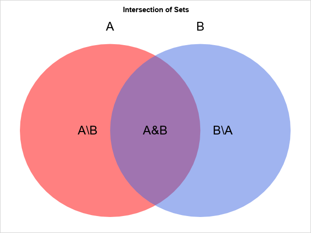
A previous article discusses how to compute the union, intersection, and other subsets of a pair of sets. In that article, I displayed a simple Venn diagram (reproduced to the right) that illustrates the intersection and difference between two sets. The diagram uses a red disk for one set, a blue disk for the other set, and makes the disks semi-transparent so that the intersection is purple.
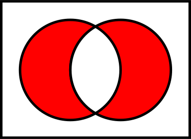
When I was creating the graph, I thought about how I might create a similar graph that shows the symmetric difference. The symmetric difference between two sets, A and B, is the set of elements that are in either A or B, but not both. This is sometimes called the "exclusive OR" (XOR) operation. To create a symmetric difference graph, or to highlight other subsets, you need to specify the colors of the three areas in the graph. For example, the Wikipedia article for the symmetric difference includes an image (shown below) that uses red for the set differences and white for the intersection. I wanted to create a similar image in SAS.
This article shows how to use the ELLIPSEPARM statement in PROC SGPLOT to create a simple Venn diagram that shows the relationships between sets. It also shows how to use the POLYGON statement to create a diagram for which you have complete control over the colors of each portion of the graph. Lastly, I provide references for SAS papers that show how to construct Venn diagrams when you want the areas of the regions to represent counts in real data.
A simple Venn diagram for sets
A simple Venn diagram is shown at the top of this article. The diagram is an abstract representation of the relationship between sets. The relative sizes of the colored areas are not important in this diagram. You can create this diagram in SAS by using two ELLIPSEPARM statements in PROC SGPLOT. You can create the text by using the TEXT statement.
You need to choose a coordinate system so that you can control the placement of the text relative to the disks. For this example, I used the following coordinates:
- The left circle has unit radius and is centered at (0, 0).
- The right circle has unit radius and is centered at (1, 0).
- The text 'A\B' is placed at (-0.25, 0). The text 'A&B' is placed at (0, 0). The text 'B\A' is placed at (1.25, 0).
First, create a SAS data set that contains the text values and positions. You can then overlay the text on a diagram that displays the disks and uses the TRANSPARENCY= option to make the disks semitransparent, as follows:
/* Visualize Venn diagram for the intersection of two sets */ data Labels; /* create labels values and locations for the graph */ tx=-0.25; ty=0; text='A\B'; output; tx= 0.5; ty=0; text='A&B'; output; tx= 1.25; ty=0; text='B\A'; output; tx= 0; ty=1.2; text='A'; output; tx= 1; ty=1.2; text='B'; output; run; title "Intersection of Sets"; proc sgplot data=Labels noautolegend noborder; ellipseparm semimajor=1 semiminor=1 / slope=0 xorigin=0 yorigin=0 fill fillattrs=(color=red) transparency=0.5; ellipseparm semimajor=1 semiminor=1 / slope=0 xorigin=1 yorigin=0 fill fillattrs=(color=royalblue) transparency=0.5; text x=tx y=ty text=text / textattrs=(size=18); xaxis display=none offsetmax=0.05 offsetmin=0.05; yaxis display=none offsetmax=0.05 offsetmin=0.05; run; |
The diagram is shown at the top of this article. If you want to extend it to three sets, I suggest using a disk centered at (0, -1).
Control over the colors in a Venn diagram
The technique in the previous section enables you to control the colors of the left and right disks, but the color of the intersection is determined by color mixing. In elementary school, we learn that red and yellow mix to become orange, red and blue make purple, and yellow and blue make green. You cannot choose the color of the intersection; the color is determined by the colors of the two disks.
To independently control the colors of the three regions (A\B, A&B, and B\A), you need to represent them as polygons and use the POLYGON statement in PROC SGPLOT. If you allow the center and radius of the circles to be arbitrary, then the geometry of the circle-circle intersection is somewhat complicated. However, I chose the position and the radii so that the geometry is as simple as possible. Namely, the two circles intersect at θ = ±π/3 with respect to the center of the first circle. Relative to the center of the second circle, the intersection points are at the angles φ = {2π/3, 4π/3}.
Recall that you can parameterize the left circle by the central angle by using the parametric equations θ → (cos(θ), sin(θ)). Similarly, if φ is the central angle of the right circle, you can parameterize the circle by using φ → (1+cos(φ), sin(φ). Because we know where the circles intersect, we can parameterize the crescent-shaped and lens-shaped regions by strategically switching from one parametric equation to another. This is carried out in the following SAS DATA step. The results are then plotted by using a POLYGON statement and the GROUP= option. To save typing, I define two macros. The %C1 macro implements the parameterization of the first circle. The %C2 macro implements the parameterization of the second circle. For this graph, I do not attempt to control the colors or to overlay text. I just show the three regions.
%macro C1(theta); x = cos(&theta); /* circle centered at (0,0) */ y = sin(&theta); output; %mend; %macro C2(phi); x = d + cos(&phi); /* circle centered at (d,0) */ y = sin(&phi); output; %mend; data XOR; /* Circles have unit radii and are centered at (0,0) and (d,0). The circles intersect at %C1(pi/3) and %C1(-pi/3) */ d = 1; pi = constant('pi'); dt = pi/45; /* step size for angles */ /* left crescent-shaped portion of the circle "A" */ ID = 'A\B'; do theta = -pi/3 to pi/3 by dt; /* crescent; use circle B params */ %C2(pi - theta); end; do theta = pi/3 to 2*pi-pi/3 by dt; /* use circle A params */ %C1(theta); end; /* lens-shaped intersection A & B */ ID = 'A&B'; do phi = 2*pi/3 to 4*pi/3 by dt; /* use circle B params */ %C2(phi); end; do theta = -pi/3 to pi/3 by dt; /* use circle A params */ %C1(theta); end; /* right crescent-shaped portion of the circle B */ ID = 'B\A'; do phi = 4*pi/3 to 2*pi + 2*pi/3 by dt; /* use circle B params */ %C2(phi); end; do theta = pi/3 to -pi/3 by -dt; /* crescent; use circle A params */ %C1(theta); end; drop pi d theta phi; run; title "Intersection of Sets"; proc sgplot data=XOR; polygon x=x y=y ID=ID / group=ID fill; xaxis display=none offsetmax=0.1 offsetmin=0.1; /* pad the margins */ yaxis display=none offsetmax=0.1 offsetmin=0.1; run; |
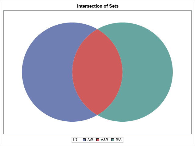
The graph consists of three polygons, each in a different color. You can merge the polygon data with the text data and overlay the text on the Venn diagram. Furthermore, you can use the STYLEATTRS statement to assign colors to each region. In this example, I use a reddish color for the two crescent-shaped regions and white for the lens-shaped region in the center.
/* combine the polygons and the text labels */ data All; set XOR Labels; run; /* use the reddish color for GraphData1 in the HTMLBlue style. See https://blogs.sas.com/content/iml/2017/02/06/group-colors-sgplot.html */ %let gcdata2 = cxA23A2E; /* a darkish red */ title "Exclusive OR: XOR(A,B)"; proc sgplot data=All noautolegend noborder; styleattrs datacolors=(&gcdata2 white &gcdata2); polygon x=x y=y ID=ID / group=ID fill outline lineattrs=(thickness=2); text x=tx y=ty text=text / textattrs=(size=18); xaxis offsetmax=0.05 offsetmin=0.05 display=none; yaxis offsetmax=0.05 offsetmin=0.05 display=none; run; |
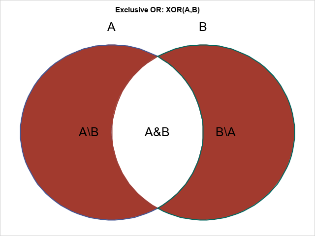
Success! To change the colors of regions, specify any colors you want for the DATACOLORS= option on the STYLEATTRS statement.
Summary
This article shows two ways to create a Venn diagram that illustrates relationships between sets such as intersection and set difference. The simplest method uses ELLIPSEPARM statements in PROC SGPLOT. You can specify colors for the disks in the diagram. By making the colors semi-transparent, the colors of the intersecting regions are determined by the standard properties of color mixing. A more sophisticated method uses basic geometry to parameterize the regions in the diagram as polygons. By using the POLYGON statement in PROC SGPLOT, you can completely control the color of each region.
Further reading
SAS customers have a long history of using SAS graphics to create Venn diagrams. Some of the diagrams are abstract, such as presented here, but others attempt to control the size and centers of the circles so that the relative areas of the circles and their intersection are proportional to counts in data. The latter graphs are called area-proportional Venn diagrams.
For example, suppose a survey reveals that 40 people like to eat hamburgers, 60 people like to eat ice cream, and 20 people like both. Let A be the set of people that like hamburgers, and B be the set of people that like ice cream. Then you could arrange the size and position of the circles so that Area(B) = 1.5*Area(A) and Area(A&B) = 0.5*Area(A).
For two sets, you can solve this problem by using circles. For three sets, you need to use ellipses to create area-proportional Venn diagrams. A discussion and algorithm are presented in the open-access article, Micallef and Rodgers (2014) "eulerAPE: Drawing Area-Proportional 3-Venn Diagrams Using Ellipses," PLoS ONE.
The following articles are about creating Venn diagrams in SAS. Some of the articles use older SAS/GRAPH routines instead of the newer ODS statistical graphics. Some authors draw a distinction between Venn diagrams and Euler diagrams.
- Harris, K. (2013) "V is for Venn Diagrams."
- Li, S. (2009), "Using SAS to Create Proportional Venn Diagrams."
- Matange, S. (2014) "Proportional Euler Diagram."
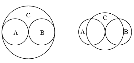
I will close by remarking that a Venn diagram for three or more sets might misrepresent the relationships between sets. The simplest example with three sets is A={1} and B={2} and C={1, 2}. There is no way to use circles (or ellipses) to draw a Venn diagram that correctly represents the relationships between these three sets. (You can, however, use rectangles for this situation.) Two attempts are shown below. The attempt on the left gives the false impression that there are elements of C that are not contained in A or B. The attempt on the right misrepresents the intersection between C and the other sets.

2 Comments
The updated paper of "V is for Venn Diagrams." is here .
https://support.sas.com/resources/papers/proceedings18/1965-2018.pdf
Thanks. I updated the link in the blog post, too.